


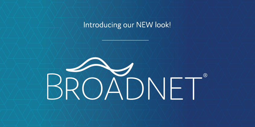
We changed our logo! Here’s why!
We have big news!
After 15 years, we’re releasing a new look! As Broadnet’s technology and suite of products have evolved, so has our design.
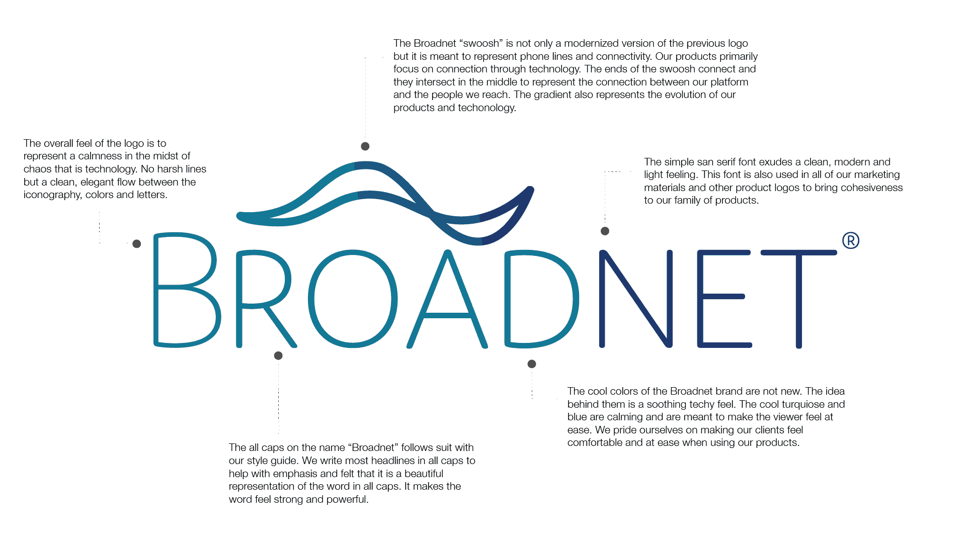
CEO Steve Patterson started Broadnet from his basement, not realizing how much the company would evolve over the coming years. He created a logo that represented the company and the products that were offered at that time. We all know that so much has changed with technology – in general, and specific to Broadnet. So with the evolving technological advancements within our company and the industry as a whole, we have decided that it was time to evolve our brand and logo with it.
Broadnet’s suite of products has grown and evolved to be more suited for the clients that use us. We pride ourselves in adjusting the products to better serve our client needs and continue to evolve what we offer. We have also created a suite of products that are designed to work together to truly help our clients engage and understand the audience they want to reach. We are in a time where this is more important than ever.
The goal of the logo changes, for not only the Broadnet logo but our product logos as well, is to make them feel more cohesive and truly like a family of products. The products are meant to work together and the look and feel needed to work together, too. As our visual brand has evolved over the last year to make our external brand become more cohesive across the board, it was time for the logo to change to match as well.
Product Logos and Wordmarks
We offer a variety or products that are truly designed to work together. We felt that it was important that the visual representation among marketing and external facing materials needs to reflect this goal. To the right you will see the full suite of product logos and wordmarks that represent Broadnet’s full suite of products.
Utilizing the same font among all logos and wordmarks, as well as marketing materials and website elements, brings the brand full circle. You will see the same font styles used across the board. The Access Live and Surveyor logos have similar creative elements to the Broadnet logo, such as the icon using the soft gradient, representing the evolution of technology and our products, as well as the font style.

We hope you like this new look and feel for Broadnet and our products! Look out for updates on our platform and among marketing efforts moving forward! Our goal is to better serve our clients and make them feel like they are part of our Broadnet family as well!


